_TIPF.jpg.c4b624fe964f2a9c93c12526ec8e4a22.jpg)
ChrisLumix
-
Posts
9,007 -
Joined
-
Last visited
-
Days Won
37
Content Type
Profiles
Forums
Events
Members' Showcase
Everything posted by ChrisLumix
-
I switched to Canon from Epson for one very simple reason - when the ink feed tube on the Epson dries out (as it will - I went through 3 or 4 Epsons in my time) the printer becomes just a pile of plastic junk. Yes, they deliver superb quality prints, but in the end I got sick of the inevitable burnout and replacement sagas. On the whole, I've found the Canon Pixma to be so near in quality it's almost undetectable.
-
Welcome to the forums Dave
-
Or "Are you a genuine electrician, or one of those who just pops into B&Q for a couple of books, plugs, and an attitude?"
-
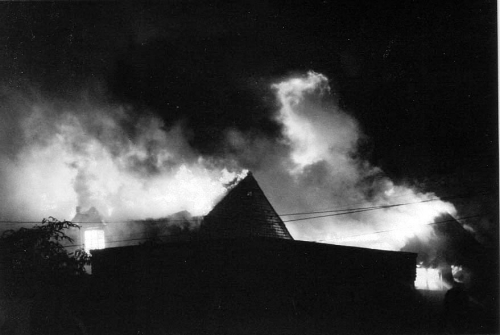
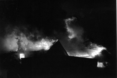
One more dramatic example : This was of a warehouse fire, predominantly orange tones as you can imagine. The first example is Channel Mixer, Red 100%, the second is Channel Mixer, Green 100%. That's it - I've done now!

-
Yes, that's why I wrote "Don't reply yet - more to come" !!
-
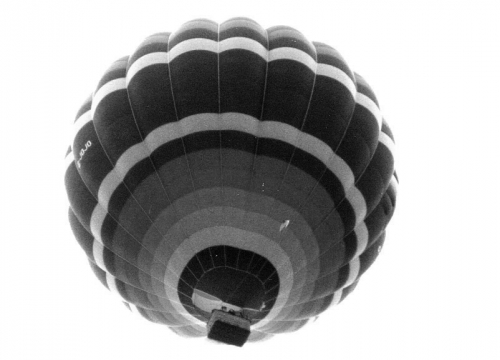
However, this is only part of the story. If all you want is a straight conversion, then the above step is quick, it's easy, and it will serve you well for many images. But, in the days of film photography, before digital, before Photoshop, B&W photography was a whole science and art unto itself. And if you've seen work by the likes of Frank Meadow Sutcliffe, Ansel Adams, Dorothea Lange, Henri Cartier-Bresson, and many others, you will appreciate just how much of an art it was. One aspect of B&W photography was to directly affect the range of greyscale tonal values by the use of coloured filters over the lens. This can be digitally simulated, and to illustrate how, the same image has been used, but this time using the Channel Mixer in Photoshop. (Image --> Adjustments --> Channel Mixer...). Open this dialogue, and click the Monochrome option. You will see three sliders, Red, Green, Blue. These can be adjusted to adjust the tonal values, with dramatic results. The following image had the Red slider to 100%, the others to 0: This one was Green to 100%, the others to 0: This one was Blue to 100%, the others to 0: These show the extremes, with each colour channel set to 100%, the others to 0%. However, you can adjust more than one slider, and see the effect it has. Just remember that if you want the same exposure and levels as the original, make sure the sliders all add up to 100%. Play around with it, but you will see that Black & White isn't just a simple On or Off feature. It can be adjusted every bit as much as colour can, and hopefully this tutorial has whetted your appetite!
-
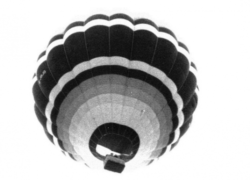
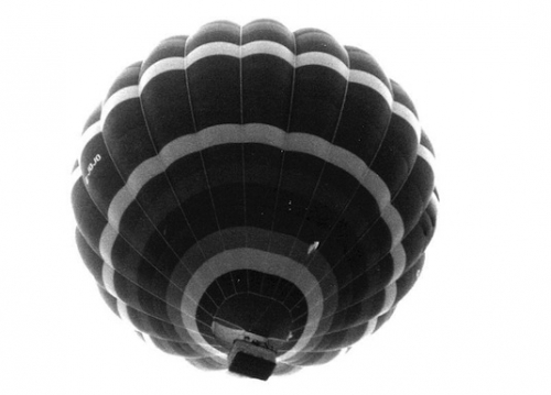
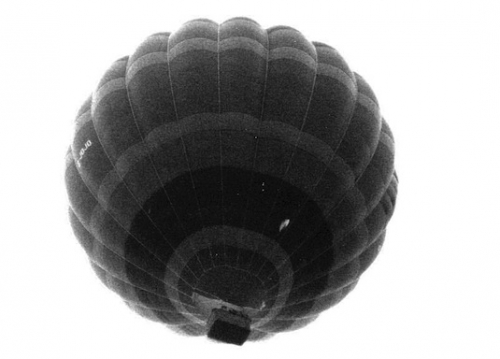
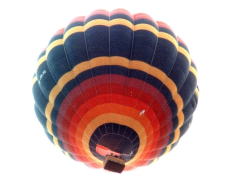
It's easy to convert a colour image to B&W in Photoshop, right? Well, yes. Take this image of a hot air balloon: Then in Photoshop, go into Image --> Mode --> Grayscale, and job done : From there, you can adjust the contrast, levels, noise, whatever you want to achieve (the image above has not been adjusted, but it could be). (don't reply yet.. more to come!)
-
-
CHOW
-
Yes, it's still there (I just Googled "Adobe CS2" and went through a few hoops to get to the relevant page). I guess you've not still got your desktop PC or you could retrieve the registration number from it?
-
If you Google "Adobe CS2" and then jump through a series of hoops (one of which may include setting up an account for their site), eventually you get to the Downloads page for CS2, where you can choose to download the entire Suite, or just the programs you want. (It doesn't include Elements, but does include Photoshop 9). The authentication / licence codes are also there.
-
POOL
-
Dave You make some good points. However, Photoshop's advantage is not with photographers alone, but anyone who aspires in any way to be a graphic artist. It can be used in a multiplicity of ways, except vector design (for which Illustrator was created). To give just one example, this was created from a photo but in no way is the final result 'photographic' : You're right that Photoshop isn't the only show in town, and there are other editors with art filters, such as Pixelmator or Seashore. But they all aspire to imitate in some way, what Photoshop is, which is something much more than 'mere' photographic work (for which Aperture, Lightroom, etc, are much more suitable alternatives). For anyone with a Mac, on a budget, I would recommend Pixelmator which provides layer-based Photoshop-like processing at a fraction of the cost. For PC users, Picasa is free, but I don't think supports layers? And last time I looked, Adobe were still giving away CS2 with registrations. I use CS2 (Photoshop 9) and Elements 6. What am I missing from later versions? Probably nothing that I can't do already, though maybe it would take me a little longer for some things.
-
C the Cat! What does the Cat C ? Can you C what the Cat C's?
-
Hi!
-
Maybe Photoshop Elements now has a Colour Balance dialogue like its older sibling? I'm using an older version (6) which doesn't, so this is aimed at anyone who has a version of Elements without a Colour Balance dialogue. First, there are already different ways to adjust colour in Elements : Variations, but you can only adjust this by about 5 or 6 steps, and sometimes the thumbnails are uselessly small Quick Fix : Temperature and Tint, which are both somewhat blunt instruments, not for precise colour adjustments Hue & Saturation dialogue, which is exactly like the full Photoshop and again, not for precise colour adjustments But those familiar with Photoshop will have used the Colour Balance dialogue, which gives sliders Red <-> Cyan, Green <-> Magenta, Blue <-> Yellow, each of which can be adjusted in minute steps separately for Shadows, Midtones, and Highlights. By now, some of you may be saying "Oh, but it IS in Elements - it's in the Levels dialogue". Yes - you can indeed choose Red Green or Blue within Levels and adjust the midtones with the middle slider. So, using Red <-> Cyan as an example : to the left adds Red to the right adds Cyan But the limitation comes with highlights and shadows : you can only adjust the slider in one direction : the highlights slider (< left) will progressively add Red to the highlights, while the shadows slider (> right) adds Cyan. You can't move those sliders in either of two directions, like the midtones slider. HOWEVER : if you use the Output Levels slider (bottom of dialogue), you can complete the Colour Balance : move the shadows slider right, and you add Red to the shadows, while the highlights slider (left) will add Cyan to the highlights. So... it's all there within the Level dialogue in Elements! It's more complicated than Photoshop, but it's good to know that if and when you really need it, it's there.
-
I had a different approach, not as well-defined as this though. But given that I would persist with a particular printer, and also have a favourite paper, I would : 1. work out the difference between the 'ideal print' onscreen, and what needed to be done in Photoshop to reproduce that in print form 2. record an 'Action Set' in Photoshop of the tweaks done as a result of 1. and apply it universally from then on each time I printed But for important prints, I would first apply the Action Set and then print off a test print of a thin strip of the image; I'd repeat test strips on the same sheet until I got it absolutely right. I would note down what I'd done in Photoshop over and above the Action Set and store it on the computer with the image file.
-
I agree with Richard - it's so variable. But having said that, the wastage rate is on average very high. Ah, for those days of film when we'd consider a shot quite carefully before shooting so as not to waste valuable film, not to mention D&P if someone else did that!
-
Steed (I suspect I know where this might go next..)
-
As another 'newbie' I can only say how friendly people here are. Welcome!
-
I suppose every cloud has a silver lining - if Lumix User hadn't closed down, I would never have discovered this one. And TIPF seems just about the right size really - not too many (dpreview) nor too few (Lumix User).
-
"Judging from the size of that zoom, you must have a very small..." ?
-
For the second, it was much easier. I just brought out detail using the Shadows slider, nothing else. (looking at final result and comparing it with the first shot, I'd actually up the levels a bit (highlights) and adjust the colour balance a bit more, away from red)).
-
I couldn't work on the large pictures as this forum won't let me 'swipe' them, so this is my efforts on the small pictures instead. (Edit: my mistake = 'swiping' the small picture actually copied the large picture to my desktop so I had to reduce it down from 4MB !!!!) For the first, I did the following : In Shadows/Highlights I reduced the highlights about 50% I cooled the temperature a little (it was too red) and adjusted the tint away from magenta and towards green, a little, also to improve the colour balance
-
The same thing happened with the Lumix User forum. Although there were few active members, it was a good place to go. I am still technically a member of the dpreview forums, but I almost never go there. It's too full of people asking "Should I get a Canon or a Nikon?" and not enough about actual photography. Mind you, they will never close down, as the rest of the site is an extremely high-profile and useful resource, testing just about every camera released.
_TIPF.jpg.c4b624fe964f2a9c93c12526ec8e4a22.thumb.jpg.565c570e5b1d92b839286ac8aa9e6df3.jpg)